Tuesday, June 16, 2009

Final Drawings


concept


ground + first floor plan


roof plan + section a


section b


section c


siteplan (showing streetline proximity, and points of accessibility)


detailed poche of intimate gallery


perspective


Sunday, June 14, 2009

Final Model

in context:
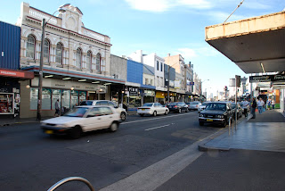
In terms of urbanity, the gallery attmpts to trace define the urban profile of King St. It's facade traces the profile of the existing retail building, aligned to both of its neighbouring properties to form a point of integration.


The facade, whose form is a derivative of its urban context, is composed of a series of sliding doors, opening up during the day to form an entrance courtyard. This public space becomes an extension of the street, becoming a space for the display of public art or social activities run by the gallery (such as holiday programs for school children nto come in and paint).


as an entity:


The wintergarden becomes a space of tranquility - catering for both public and private functions, a place for conversation and catharsis.

Light shafts articulated above each of the mezzanine spaces, with aperture filters to reduce the impact of natural sunlight. the light entering the space becomes diffuse - akin to the beholder.


Monday, June 8, 2009

Ideas 02


Material/Immaterial
Contrast between the mass of boxes and the floorplane was created through materiality - with horizontally laid jarrah cladding these volumes and sand blasted concrete tiled across the floor. The contrast between dark and light/ smooth and rough textures in this manner emphasises the conceptual significance of these masses.


Capturing the light
Light shafts aligned to each of the gallery mezzanine spaces do not directly bring light in, but filters them through an aperture to welcome a more diffuse, less impacting light - more akin to to humanity, gently guiding them through the gallery space. An open wintergarden provides a space for not only the display of sculptural/artistic works, but also for human conversation - where public or private events can be held. All glazed wall openings are shielded with a suspended timber grille, softening the light protruding into the gallery and providing a visual connection between spaces.

Timelessness
The gallery's form is derived from its urban context, following the rhythm of the street and tracing the profile of the existing building to solidly define its presence. The facade then became the profile of extrusion, stretching across the site and deriving the form of its interior (to be the expressed vault of a pitched roof).

The ground floor plane is raised from the existing building's demolition remains - providing a historical reference to the site, as visitors are able to look through brightly lit, open voids. This notion also gives the impression that the volumes within this space are levitating, accentuating the lightness of touch in the weight of its architectural presence.

Friday, June 5, 2009

Ideas 01


Programme
Functional requirements of the gallery were grouped and laid out accordingly to circulation - forming a sequence of 'block' like servicing zones and 'leftover' circulation space (used to guide people around the building and for the display of works). This became the basis for the concept of volumes in space.

The private appartment is positioned towards the front of the gallery, allowing for the owner to have direct access to the services provided by King St - a place inccuring social activity and cultural diversity. In the same sense, the storage facility is located at the rear of the gallery allowing for direct access from the public carpark for transportation docking artworks.

The entrance courtyard can be used for the display of public art, and also for social events and workshops, such as school holiday art programs. As an extension of this space, the reception area is integrated with an open workshop area, allowing for meandering visitors to view the process of illustration/sculpting (by freelance artists).


Volumes in space
The idea of the lightness of masses was developed from the weightless nature of Tran's and Jinks' works. Uniform blocks were then derived from a grid, each configures to define the spatial context in which they dwell. These volumes do not touch the structurally expresed ceiling, and protrude beneath a cantilevered floorslab, isolating themselves from the architectural to accentuate their lightness.


Solid/Void studies
Massing and Programme

Internal figure ground

Thursday, May 28, 2009

Atmospheres

Development ideas on what experiential qualities could be induced by the Gallery.


Levitation of volumes, with expressed structure to emphasise its architectural presence, and to bring a sense of rhythm which guide the behoder throughout the building.


Lifting the floor plane above the ground level, expressing the excavation beneath and making a historical reference to the site.


Staircase Scheme
This scheme for a full height staircase puts emphasis on the heaviness of architectural elements, monolithic in its presence, inducing a sense of permanence.


Case Study: Paddington Reservoir (Tonkin Zulaikha Greer)
A short visit to this renewed site provided ideas on how the essence of lightness (portrayed in both Tran's and Jinks' work) could be conveyed architecturally.

Delicate columnar supports which hold up massive architectural elements.


Providing bridge links between masses of space.


Lights placed beneath the floorslab - illuminated towards the edges to imply the idea of a floating mass.

Monday, May 25, 2009

Case Study 02 - Vahalla (Tanner)


I was in Glebe the last Friday, visiting some friends at their design studio in the Valhalla. What used to be a heritage cinema had become refurbished (By Tanner Architects) into a beautifully designed studio space on the urban sprawl of Glebe Point Rd. The continually changing levels in each floor and alignment of voids are very well articulated - contributing to the atmosphere of the space.

Unlike many buildings I enter today, this is a place which actually feels good.


If you are interested in fashion design, Jacqui Alexander and Zac Midalia were the guys I saw at the Valhalla, click here to have a look at their upcoming label. It's the next big thing.

Tuesday, May 19, 2009

Case Study 01: Museum of Modern Literature (David Chipperfield)

In germany, this museum is one which restrains its manterial pallette intentionally, allowing the diffuse light entering through grilled openings to illustrate its monolithic presence.


Horizontally protruding skylight, illuminating the space.


Differentiation of spaces formed through interlocking volumes.


Materiality, and welcoming.


Light casting shadows amongst the colonnade, forming a sense of rhythm about the exterior.

Sunday, May 17, 2009

Client, Narrative and Artists

Client + Narrative
"A young woman and friends, in search of independent artists - weightless illustration and realist sculpture."


Selected Artists

These two emerging contemporary artists practice in completely different workfields. Despite, their works display a similarity in the theme of lightness. Neither ever feel heavily impounding nor attention seeking.


1. Kevin Tran - Illustrator
http://www.kevintrandesign.com/


Media:
Oils, Acrylics, Ink


Kevin Tran is an Sydney based Illustrator. He creates works which have a lightness of touch regardless of the subject's true heaviness.


2. Sam Jinks - Sculptor
http://www.samjinks.com/

Media -
Silicon, Paint, Human Hair


Sam Jinks is an Australian Sculptor. His work focuses on the emotive human being, deep in self conversation, suspended in an ocean of air.

Site Analysis


Aerial

Photos

King Street View of the site, currently Franklins retail store (approx 11m wide)


Approach from Whateley Lane - glimpse of left hand side.


Church facing the site on King St. Reference for form/ reflections/ approach.


View of the Public Carpark behind the site - accessibility points.


Camperdown Memorial Park - to the rear of the site.


Depth

Proximity studies.
Relationship between the site (urban infill), Camperdown Memorial Rest Park and Church. The issue of linking these two iconic elements of the site arises - how is the gallery going to provide a neutral ground and thoroughfare for the public. This study also looks at how the building will be approached, from both the City and Newtown areas. The gallery needs to welcome people approaching from both directions as a place of social activity and recreation.


Elevation Studies.
Defining the street is an issue which will influence the outcome of the design for this gallery. The existing site currently breaks the rhythm formed by its two neighbouring properties (inclusive of the dendy) - rising up a level taller. The question is whether to trace this profile, or to continue this line of the street - either of which will form a solid integration into the site.


Plan Study.
Site boundaries and its relationship to public services - the public carpark, retail, religious and recreational.